Blog Semify Receives RedHawk50 Award to Celebrate Outstanding Growth Read More March 18, 2024 7:13 pm
Blog Traffic and Conversion Summit: Digital Marketing Conference Takeaways For Your 2024 SEO Strategy Read More February 14, 2024 7:54 pm
Blog Semify’s Small Business Survey Finds Half of SMBs Don’t Use SEO Read More December 12, 2022 8:00 am
Blog Direct Response Vs Brand Awareness: Which is Best For Your Strategy? Read More August 10, 2022 6:47 am
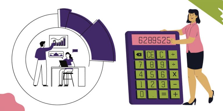
Blog How to Calculate Customer Acquisition Cost (CAC) For Your Agency Read More July 22, 2022 9:18 am
Blog Domain Rating Vs Domain Authority: Do These Made-Up Metrics Matter? Read More June 17, 2022 7:54 am
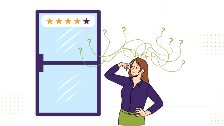
Blog Troubleshooting Yelp Reviews: Why Yelp Reviews Disappear and How to Address Negative Reviews Read More April 18, 2022 9:47 am